Summary Statistics + Plots Solutions
Packages
penguins
The penguins dataset includes measurements for penguin species, island in Palmer Archipelago, size (flipper length, body mass, bill dimensions), and sex.
Take a glimpse of the penguin dataset below. How many rows? How many columns?
glimpse(penguins)Rows: 344
Columns: 8
$ species <fct> Adelie, Adelie, Adelie, Adelie, Adelie, Adelie, Adel…
$ island <fct> Torgersen, Torgersen, Torgersen, Torgersen, Torgerse…
$ bill_length_mm <dbl> 39.1, 39.5, 40.3, NA, 36.7, 39.3, 38.9, 39.2, 34.1, …
$ bill_depth_mm <dbl> 18.7, 17.4, 18.0, NA, 19.3, 20.6, 17.8, 19.6, 18.1, …
$ flipper_length_mm <int> 181, 186, 195, NA, 193, 190, 181, 195, 193, 190, 186…
$ body_mass_g <int> 3750, 3800, 3250, NA, 3450, 3650, 3625, 4675, 3475, …
$ sex <fct> male, female, female, NA, female, male, female, male…
$ year <int> 2007, 2007, 2007, 2007, 2007, 2007, 2007, 2007, 2007…We have 344 rows and 8 cols
Now, calculate the median flipper length for all penguins.
# A tibble: 1 × 1
  med_flipper
        <dbl>
1         197
Now, calculate the mean body mass of penguins for each sex.
Visualizing penguin weights
We are going to be using functions in the ggplot package to visualize data. This link will be helpful for us as we get more familiar with the verbiage: https://ggplot2.tidyverse.org/reference/
Analyzing a single variable is called univariate analysis
- Make a histogram of the penguin’s body mass by filling in the … with the appropriate arguments below.
penguins |>
  ggplot(
       aes(x = body_mass_g)) + #type variable name here
       geom_histogram(binwidth = 150) #type geom here
Warning: Removed 2 rows containing non-finite outside the scale range
(`stat_bin()`).
Pull up the help file for the geom you used to make the histogram. Search for binwidth and read about it’s description. Next, play around with the binwidth argument inside the geom. Set an appropriate binwidth.
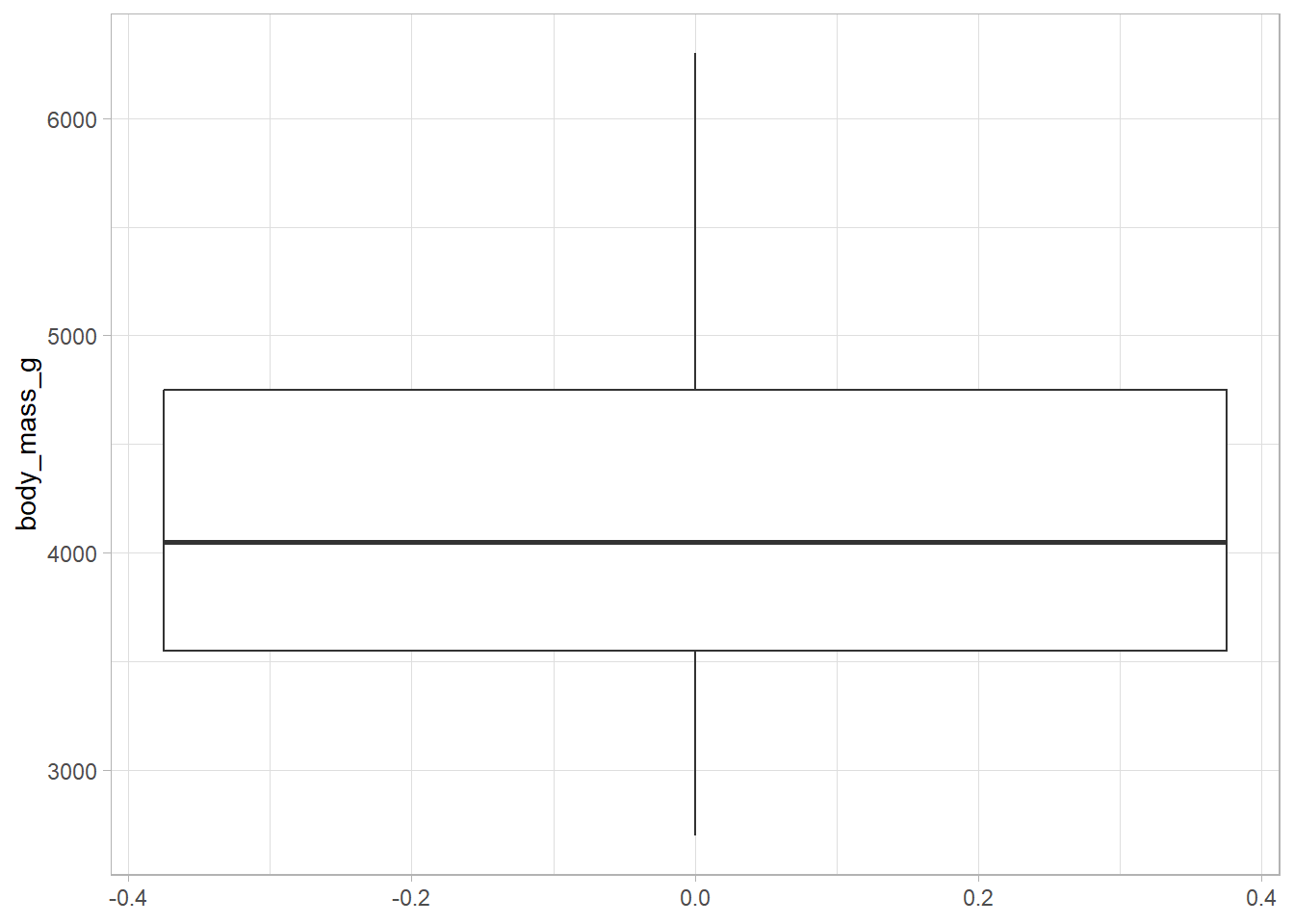
- Now, make a boxplot of the penguin’s body mass.
penguins |>
  ggplot(
    aes(y = body_mass_g)
  ) +
  geom_boxplot() +
  theme_light()
Warning: Removed 2 rows containing non-finite outside the scale range
(`stat_boxplot()`).
Let’s add a theme to your boxplot! Visit the following website, and layer on a theme (e.g. theme_bw()). https://ggplot2.tidyverse.org/reference/ggtheme.html
Two variables
Analyzing the relationship between two variables is called a bivariate analysis.
Note: aesthetic is a visual property of one of the objects in your plot. Aesthetic options are:
x y shape color size fill
-
Together: In order to choose the correct aesthetic option, think critically about how you want your variable to be mapped to your plot. Do you want a variable on the x axis? Use
x =. Do you want a variable to change the color of the geometric shape? Usecolor =orfill =! Let’s practice.
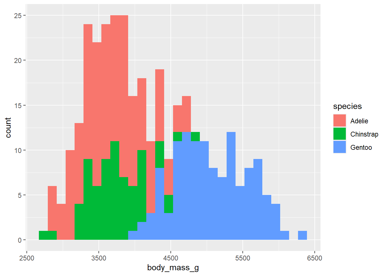
Make a histogram of penguins’ weight where the bars are colored in by species type.
penguins |>
  ggplot(
    aes(x = body_mass_g,
        fill = species
        )
  ) +
  geom_histogram()
`stat_bin()` using `bins = 30`. Pick better value with `binwidth`.Warning: Removed 2 rows containing non-finite outside the scale range
(`stat_bin()`).
Takeaway: aes changes or plot based on variables in our data set. If we want to fill the bars conditioned on another variable, this goes in the aes() function. Note that the code will not run if we put fill = species in geom_histogram(). We can change features of the plot, not conditioned on data, by overriding arguments in geom_histogram(). For example, we can paint the bars blue by setting fill = "blue" in geom_histogram(). If we were to type fill = "blue" in the aes() function, it would create a fill variable for us with the categorical value of blue (which doesn’t make sense).
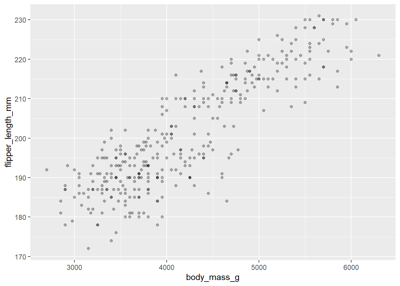
- Now, let’s make a scatterplot! We are going to investigate if there is a relationship between body mass and flipper length! Let’s also introduce the idea of
alpha!
penguins |>
  ggplot(
    aes(x = body_mass_g, y = flipper_length_mm)
  ) +
  geom_point(alpha = .3)
Warning: Removed 2 rows containing missing values or values outside the scale range
(`geom_point()`).
Takeaway: alpha is a very useful data visualization tool. This is especially true when you have overlapping data. The darker the area, the more dots are overlapped! This is something that can not be seen at alpha = 1.
