Sampling Distributions + Central Limit Theroem
Solutions
Load packages
What is the central limit theorem? (notes to refer back to)
The central limit theorem is a statement about the distribution of the sample mean, \(\bar{x}\).
The central limit theorem guarantees that, when certain criteria are satisfied, the sample mean (\(\bar{x}\)) is normally distributed.
Specifically, if
-
Observations in the sample are independent. Two rules of thumb to check this:
- completely random sampling
- if sampling without replacement, sample should be less than 10% of the population size
and
-
The sample is large enough. The required size varies in different contexts, but some good rules of thumb are:
- if the population itself is normal, sample size does not matter.
- if numerical require, >30 observations
- if binary outcome, at least 10 successes and 10 failures.
then
\[ \bar{x} \sim N(\mu, \sigma / \sqrt{n}) \]
i.e. \(\bar{x}\) is normally distributed (unimodal and symmetric with bell shape) with mean \(\mu\) and standard deviation \(\sigma / \sqrt{n}\). The standard deviation of the sampling distribution is called the standard error.
The standard deviation of the sample mean depends on the number of samples, \(n\).
Practice using CLT & Normal Distribution
Let \(X\) be the bone density of 65-year-old women. We can write this distribution of \(X\) in mathematical notation as
\[X \sim N(809, 140)\]
Write the above mathematical notation as a sentence below.
The bone density for 65 year old women is distributed normal with a (population) mean of 809 units and a standard deviation of 140
Visualize the population + sampling distribution
A sampling distribution is a distribution of all of the possible values of a statistic; computed from randomly drawn samples of the same size from a population.
Assume that our sample statistic is size n = 100. Let’s visualize the difference between the population and sampling distribution below.
ggplot(data = data.frame(x = c(809 - 140*3, 809 + 140*3)), aes(x = x)) +
  stat_function(fun = dnorm, args = list(mean = 809, sd = 140),
                color = "black") +
  stat_function(fun = dnorm, args = list(mean = 809, sd = 140/sqrt(10)),
                color = "red",lty = 2) + theme_bw() +
  labs(title = "Black solid line = population dist., Red dotted line = sampling dist.")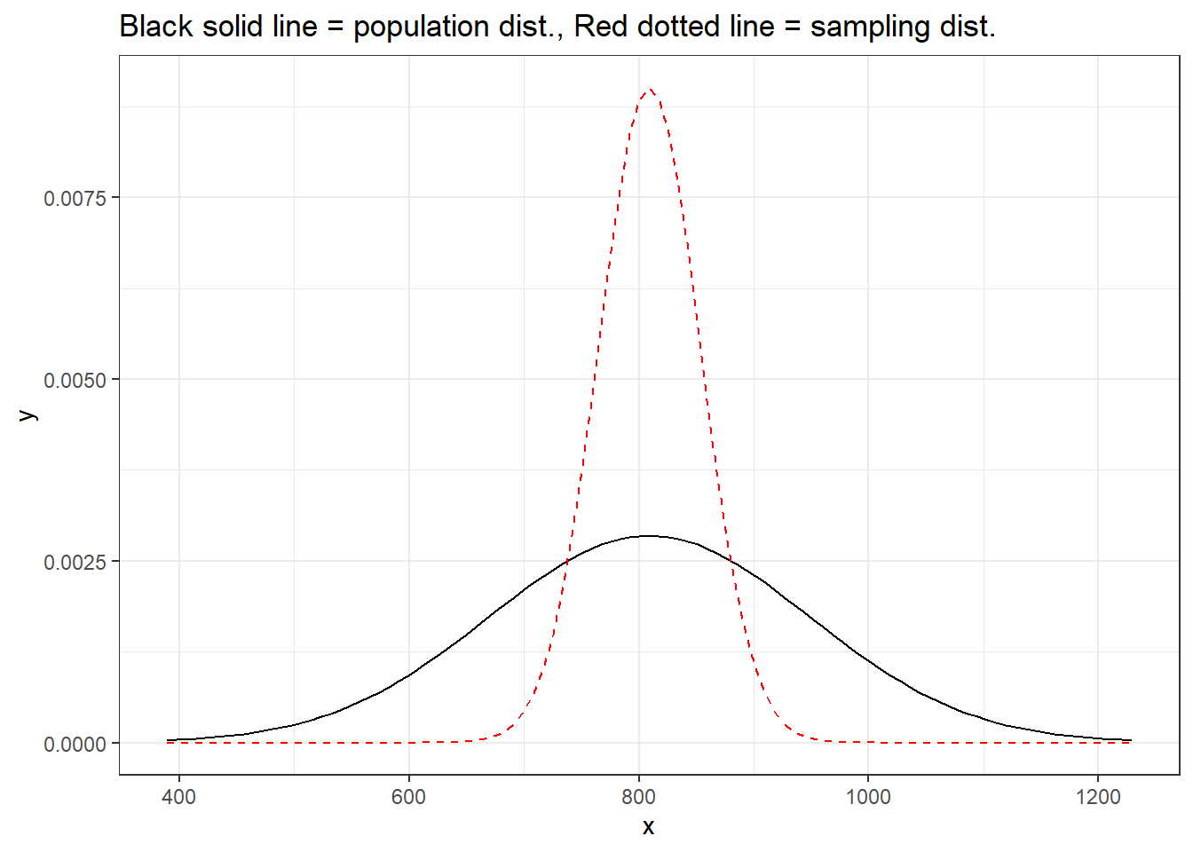
Takeaways:
– The sampling distribution has the same mean as the population distribution (showed this last time)
– The spread of the sampling distribution is smaller than the population distribution n vs \(\frac{\sigma}{\sqrt{n}}\)
– The sampling distribution is normal because the population distribution is normal.
HOWEVER in practice…. you don’t know the population distribution. What if it isn’t normal?
Central limit theorem with non-normal population distribution
Below, we are going to generate a population distribution. This is not observed in real life. We are simply pretending we know this for demonstration purposes.
set.seed(333)

rs_pop <- tibble(x = rbeta(100000, 1, 5) * 100)

rs_pop |>
  ggplot(
    aes(x = x)) +
geom_density(fill = "blue") 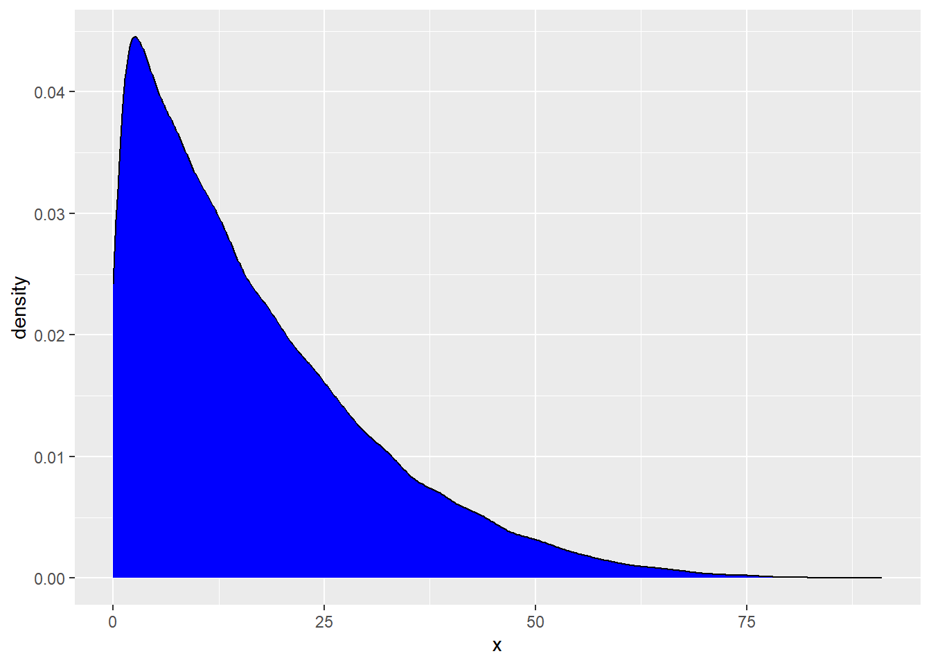
What is the shape of this distribution?
Right skewed (has a long right tail)
We are now going to generate the sampling distribution. Note: A sampling distribution is a distribution of all of the possible values of a statistic; computed from randomly drawn samples of the same size from a population. We are simulating many many possible values to show off how the central limit theorem works.
We are going to simulate 5000 sample means of size n = 50. You can assume that observations from the population distribution are independent from each other.
# A tibble: 5,000 × 1
    xbar
   <dbl>
 1  17.2
 2  15.8
 3  17.7
 4  14.2
 5  14.4
 6  17.8
 7  16.0
 8  16.1
 9  16.4
10  15.6
# ℹ 4,990 more rows
Now, create a histogram of the sample means below. But, before you do…. please answer the following question:
– Do you expect this distribution to be normally distributed or not? Justify your answer?
Yes, we expect the sampling distribution of the mean to be normal. We have randomly sampled data + 50 is < 10% of the population size.
Our sample size of 50 is larger than the CLT requirement of 30.
sampling |>
  ggplot(
    aes(x = xbar)
  ) +
  geom_histogram()
`stat_bin()` using `bins = 30`. Pick better value with `binwidth`.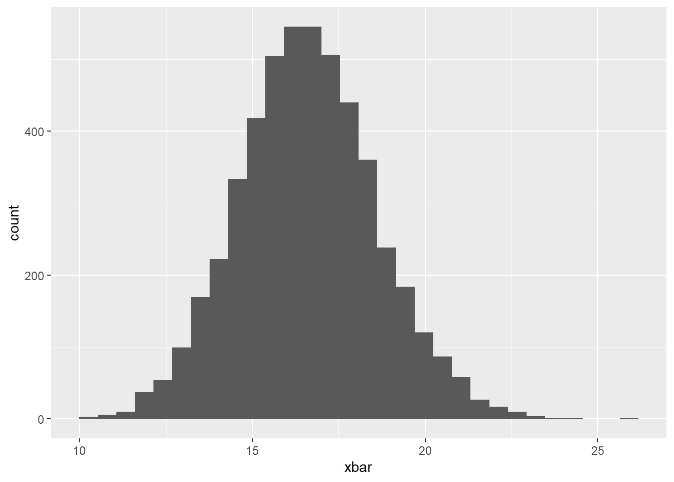
# A tibble: 1 × 1
  center
   <dbl>
1 16.6# A tibble: 1 × 1
center
<dbl>
1 16.6We know that the mean of our sampling distribution should be about the same as the mean of our population distribution. We see this above!
Small Sample Size
Now, let’s change our sample size to 2, violating as assumption of the CLT, and see how it impacts our sampling distribution.
# A tibble: 5,000 × 1
    xbar
   <dbl>
 1 25.1
 2 16.5
 3 32.2
 4 43.7
 5 12.6
 6  1.02
 7 11.0
 8  4.46
 9 23.3
10  8.24
# ℹ 4,990 more rows
Again, create a histogram of the sample means.
Before you make the graph, do you expect this distribution to be normally distributed or not? Justify your answer?
No, I don’t think the sampling distribution of the mean will be normal.
Independence: We have random samples of size 2, which is less than 10% of the population. Good!
Sample size: However, 2 is less than 30. This is evidence that this assumption is violated.
sampling |>
  ggplot(
    aes(x = xbar)
  ) +
  geom_histogram()
`stat_bin()` using `bins = 30`. Pick better value with `binwidth`.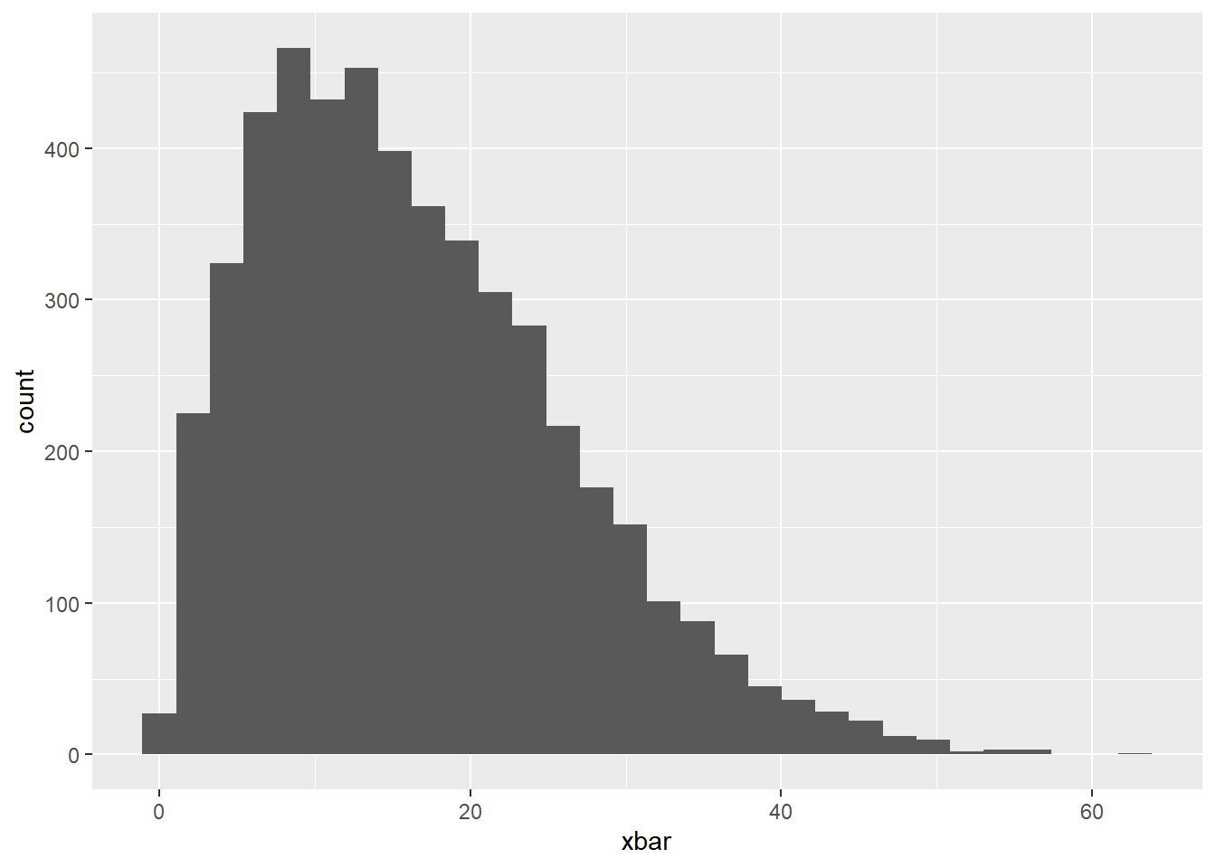
Comment on the shape of the distribution below. Why is this important?
This is right skewed (like the population dist). With a “non-normal” sampling distribution, we can’t assume normality, thus can’t use those named distributions (t and z) to estimate sampling variability.
