Simulation studies
For difference in proportions
This is code that goes along with the slides from class!
Packages
Hypothesis testing
Simulation study for penguin hypothesis test:
x - species
y - sex
\(Ho: \pi_g - \pi_c = 0\)
\(Ha: \pi_g - \pi_c > 0\)
Data
penguin_data <- penguins |>
  filter(species %in% c("Gentoo", "Chinstrap"),
         !is.na(species),
         !is.na(sex)) |>
  droplevels()

penguin_data |>
  group_by(species, sex) |>
  summarise(size = n())
`summarise()` has grouped output by 'species'. You can override using the
`.groups` argument.# A tibble: 4 × 3
# Groups: species [2]
species sex size
<fct> <fct> <int>
1 Chinstrap female 34
2 Chinstrap male 34
3 Gentoo female 58
4 Gentoo male 61penguin_data |>
select(species, sex)# A tibble: 187 × 2
species sex
<fct> <fct>
1 Gentoo female
2 Gentoo male
3 Gentoo female
4 Gentoo male
5 Gentoo male
6 Gentoo female
7 Gentoo female
8 Gentoo male
9 Gentoo female
10 Gentoo male
# ℹ 177 more rowsThe simulation
The plot
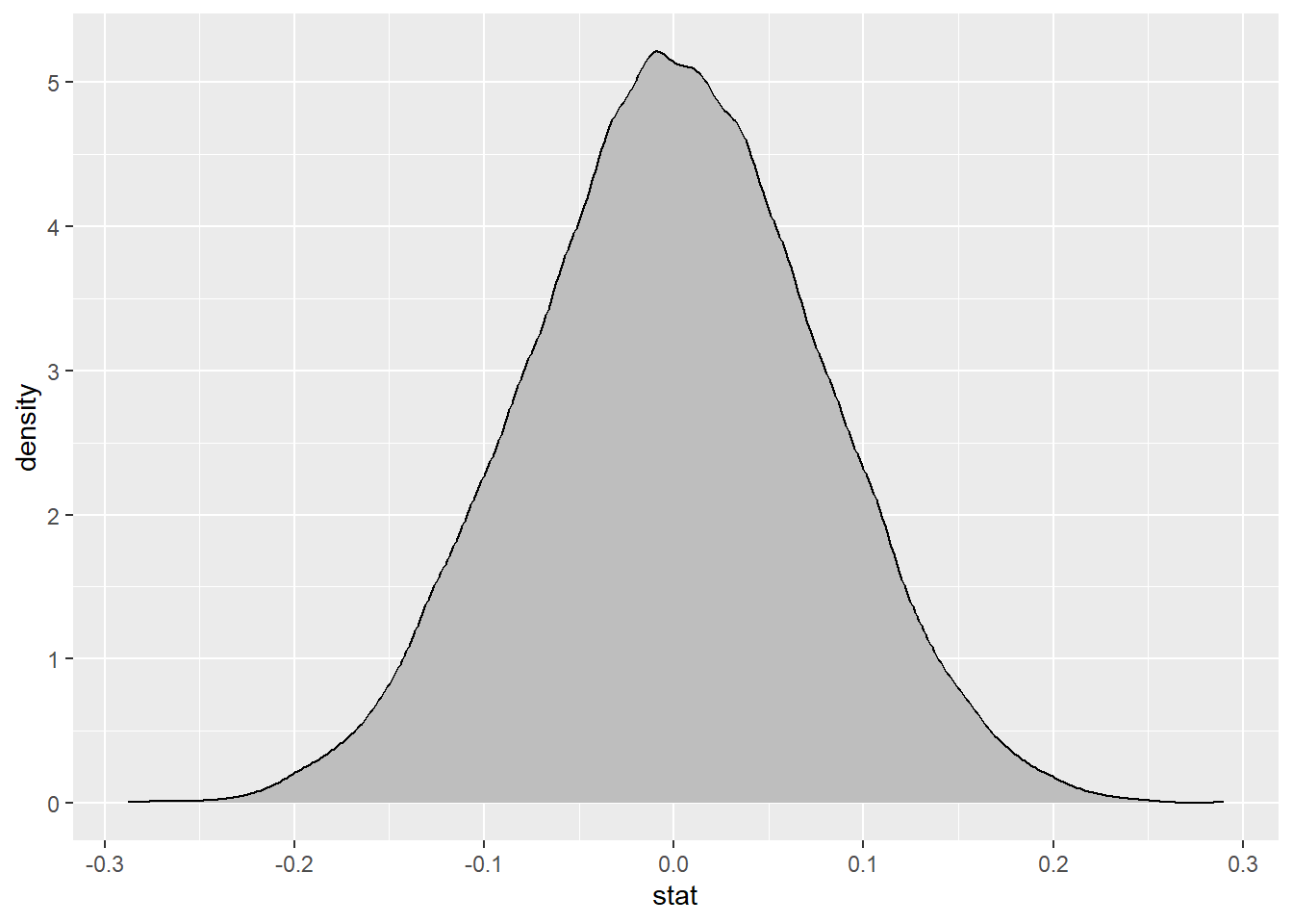
null_dist |>
  ggplot(
    aes(x = stat)
  ) +
  geom_density(fill = "gray")
– Where is this centered? Why does this make sense?
This is centered at the null value of 0, because we assume that species and sex are independent.
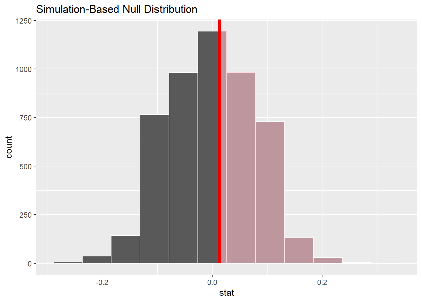
P-value
null_dist |>
  get_p_value(obs_stat = 0.013, direction = "right")
# A tibble: 1 × 1
p_value
<dbl>
1 0.375visualize(null_dist , bins = 12) +
shade_p_value(obs_stat = 0.013, direction = "right")
Confidence intervals
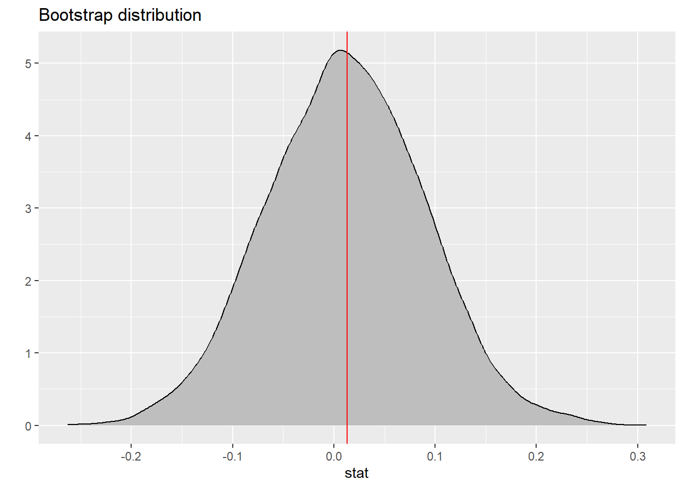
The Graph
boot_df |>
  ggplot(
    aes(x = stat)
  ) +
  geom_density(fill = "gray") +
  labs(title = "Bootstrap distribution",
       y = "") +
  geom_vline(xintercept = 0.013, color = "red")
