library(tidyverse)
library(palmerpenguins) #The data set name is penguinsData Viz II - Solutions
Let’s revisit the penguins data set.
Packages
Let’s start by practicing debugging code. Below, there are 3 things wrong with the code. Let’s go through line by line and identify the issues together!
penguins |>
  ggplot(
       aes(x = body_mass_g, fill = species)) +
       geom_histogram(binwidth = 200, alpha = .5)
What if we don’t want the overlap? We can use facet_wrap to split the histograms apart! This function takes the name of the variable you want to split by, and how many cols/rows you want your plots to show up in. Note: the syntax for this function is ~variable.name. Run ?facet_wrap in your console to see the name of the row and column arguments within facet_wrap().
penguins |>
  ggplot(
       aes(x = body_mass_g, fill = species )) +
       geom_histogram(binwidth = 200, alpha = .7) +
       facet_wrap(~species, nrow = 3)
Warning: Removed 2 rows containing non-finite outside the scale range
(`stat_bin()`).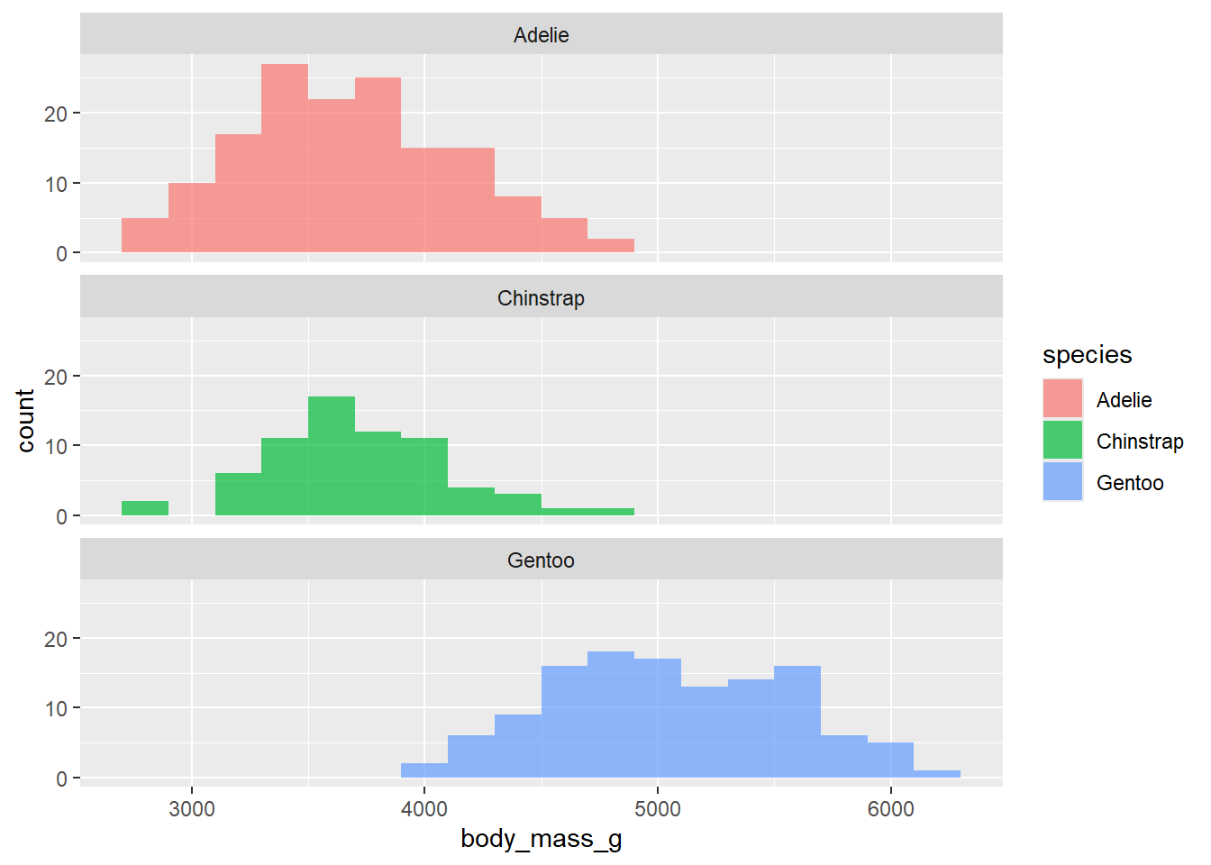
Let’s talk about labels! Labels go a long way in making an effective data visualization. To layer on labels, we are going to use the labs() function. Arguments within this function that we will use include:
x y title subtitle caption arguments in your aes, and more!
The help file can be found here
Let’s practice below. Add appropriate labels to our plot.
penguins |>
  ggplot(
       aes(x = body_mass_g, fill = species )) +
       geom_histogram(binwidth = 200, alpha = .7) +
       facet_wrap(~species, nrow = 3) +
  labs(x = "CHANGE",
       y = "Count",
       title = "Penguins weight by species",
       subtitle = "look at this!",
       fill = "CHANGE")
Warning: Removed 2 rows containing non-finite outside the scale range
(`stat_bin()`).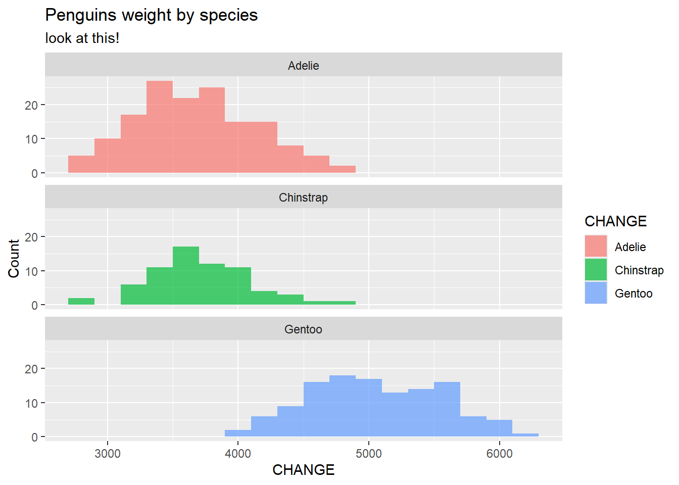
Note: Every plot you make in this course should have appropriate labels. Do not let R generate them for you with variable names from the data set.
Now, lets make a scatter plot between bill length and bill depth. Color the points by species and shape the points by island.
penguins |>
  ggplot(
    aes(x = bill_length_mm,
        y = bill_depth_mm,
        shape = island,
        color = species)
  ) +
  geom_point() +
  facet_grid(species~island) +
  labs(shape = "CHANGE")
Warning: Removed 2 rows containing missing values or values outside the scale range
(`geom_point()`).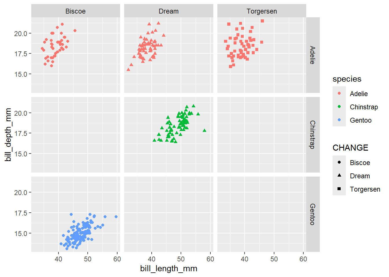
If you want to make a series of plots based on more than 1 variable, you can use facet_grid. For more information on the difference, please reference the following: https://stackoverflow.com/questions/20457905/whats-the-difference-between-facet-wrap-and-facet-grid-in-ggplot2.
The help file for facet_grid can be found here
Add the following code to your above plot: facet_grid(species~island)
Create side-by-side boxplots to compare body mass across species. Color the boxplots by species.
penguins |>
  ggplot(
    aes(x = body_mass_g, y = species, fill = species)
  ) +
  geom_boxplot() +
  theme(legend.position = "gone")
Warning: Removed 2 rows containing non-finite outside the scale range
(`stat_boxplot()`).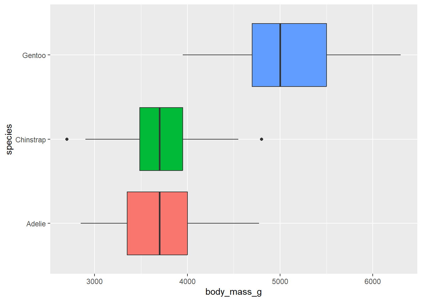
Do we need a legend? Why or why not?
No. This information is on the y-axis
Let’s use the function theme to turn off the legend (for practice). Theme (different from adding a color theme) allows us to control a lot of the visual and text features of our plot. Please see the following reference here
Add the following code to the above plot to turn off the legend: theme(legend.position = “none”). Note: We discovered in class that you can also use “gone”!
We need to think critically about color when thinking about creating visualizations for a larger audience: https://ggplot2.tidyverse.org/reference/scale_viridis.html
Think about this is as our first introduction. We can create a colorblind friendly pallet using scale_colour_viridis_d() or scale_colour_viridis_c() depending on the type of variable we are working with.
penguins |>
  ggplot(
    aes(x = body_mass_g, y = bill_length_mm , color = species)
  ) +
    geom_point() +
  scale_color_viridis_d(option = "C")
Warning: Removed 2 rows containing missing values or values outside the scale range
(`geom_point()`).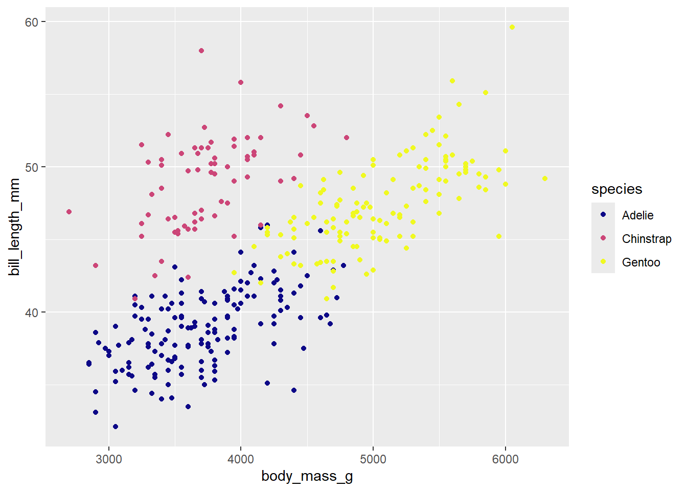
Recreate
Our task is to recreate the following image on our class slides. Hint: This plot uses theme_minimal() and scale_color_viridis_d(option = "D).
Hint: To make a scatterplot, we use geom_point. This is asking to space out or jitter the points over top the box plot. Our helpful link is a good reference for this: https://ggplot2.tidyverse.org/reference
penguins |>
  ggplot(
    aes(x = body_mass_g, y = species, color = species)
  ) +
  geom_boxplot() +
  geom_jitter() +
  labs(x = "Body Mass (g)",
       y = "Species",
       title = "Weight distribution of penguins") +
  theme_minimal() +
  theme(legend.position = "gone") +
  scale_color_viridis_d(option = "D")
Warning: Removed 2 rows containing non-finite outside the scale range
(`stat_boxplot()`).Warning: Removed 2 rows containing missing values or values outside the scale range
(`geom_point()`).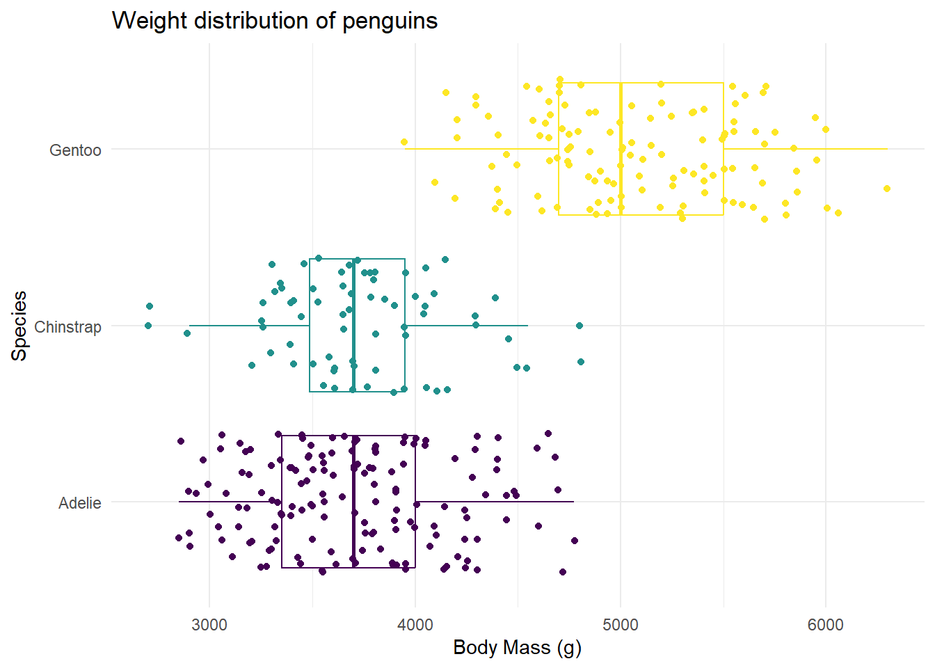
What if you flipped the order of the geoms? What happens?
If you flip the order of the geoms, the dots are hidden behind the boxplot! This would then not be an effective use of layering geoms.
